Inside the Interior Formatter
Why the pages look calm.
Open a book from a real publisher and the text sits evenly on the page. Nothing snags. Most readers never work out why — they only notice when it is missing. We set one novel three ways and measured every line. Here is what we found, and how the formatter gets there.
One novel, set three ways
What careful typesetting gives your reader.
We set the same full-length novel in our formatter, in a leading commercial formatter, and in Microsoft Word set up by hand. Same typeface, same size, same line length: EB Garamond at 12pt on a line exactly 288 points wide, so every tool had the same job. Then we measured the exported PDFs, not our own engine's opinion of itself.
That is what the formatter does for every page, automatically. The measurements below come from our default setting, Balanced, and how each was counted is at the bottom of the page.

See it on your own manuscript.
Bring your Word file and read every typeset page before you pay anything.
Start with the page, not the theory
The same paragraph, broken two ways.
Word processors, browsers, and most self-publishing tools break a paragraph one line at a time: fill a line until the next word will not fit, start a new line, repeat. It is fast and it never looks back. When a line ends up short of words, the gaps between the remaining words stretch to fill it out.
A book typesetter looks at the whole paragraph and chooses every line break together, accepting a slightly worse line here to avoid a much worse line there.
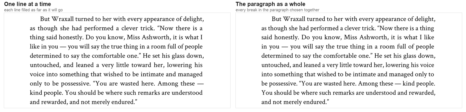
Word breaks one line at a time. In the novel, 27.6% of Word's word gaps are stretched more than a third past normal; ours, 2.9%. Past half again as wide, where a gap starts to read as a hole: Word 14.0%, ours 1.0%. Both books fit the same text on a line — 61 and 62 characters, eleven word gaps — so nobody squeezed more words in. The difference is where the leftover space went.
The mechanism
Knuth–Plass, in full.
The method is the Knuth–Plass algorithm, published in 1981 and still the reason TeX-set mathematics and most quality book work looks the way it does. It scores every possible way of breaking a paragraph and keeps the cheapest.
Loose and tight lines cost badness, which rises as the cube of how far a line is stretched — so one very loose line costs far more than several slightly loose ones, which is exactly how the eye reads it. Hyphens cost extra. Two hyphens in a row cost extra again. So does a tight line sitting directly beneath a loose one, because that contrast is what makes a page look patchy.
Ours is a faithful implementation rather than an approximation of one: TeX's badness curve, its four fitness classes at the standard thresholds, its demerit formula, and its penalties for consecutive hyphens and mismatched neighbors. Word division uses Liang's hyphenation algorithm over TeX's own English patterns — the same pattern-matching method TeX and LaTeX use, rather than a dictionary lookup.
The breaker also knows the letters can stretch a little, so it prices each line the way it will actually be drawn. That turns out to be the biggest single lever on the page.
Where the slack goes
Stretch the letters, not just the spaces.
Even with perfect line breaks, a justified line almost never comes out exactly the width of the column. Something has to absorb the difference. Nearly every tool puts all of it into the word spaces. The other formatter pushes a median 11.5 points into the spaces of every justified line; Word, 3.8.
We put it into the letterforms first — scaling the glyphs horizontally by up to 4%, and only passing what is left to the word spaces. Ours: 0.0 points. This is not letter-spacing, which pushes letters apart and is instantly visible. It is the shapes themselves, by an amount you cannot see directly.
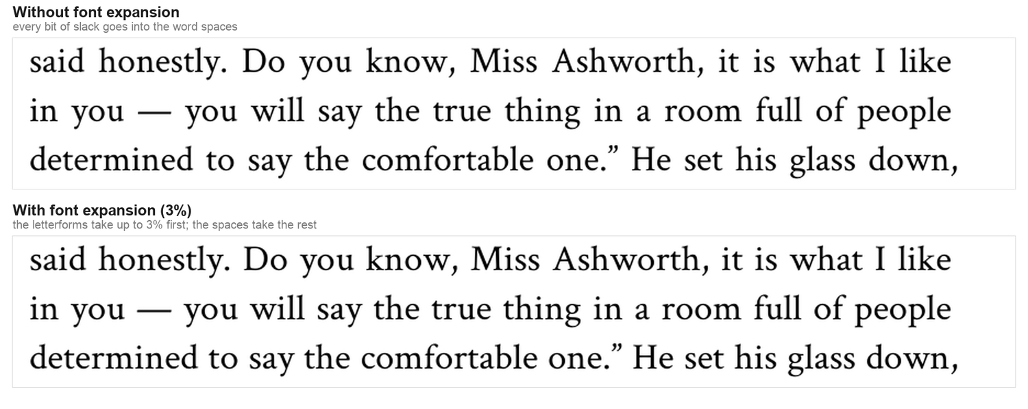
And it happens inside the line breaker, the way pdfTeX does it, not after it. The breaker knows how much of each line the letters will absorb, so it stops avoiding breaks that only look loose on paper. We set the novel three ways to show what each part is worth:
| The novel, set with | No expansion | Applied after breaking | Inside the breaker |
|---|---|---|---|
| Gaps stretched past 133% | 21.6% | 5.2% | 2.9% |
| Pages with a river of white | 24 | 11 | 3 |
| Paragraphs with a loose line | 39.5% | 8.9% | 3.8% |
| Pages that fill to the bottom | 92.5% | 95.8% | 98.7% |
| One-word last lines | 12.8% | 13.5% | 5.7% |
| Pages in the book | 298 | 298 | 292 |
The cap is 4%. We tested 2%, which is pdfTeX's figure, and it made our books worse: the breaker committed to lines expecting help the cap could not deliver, and the shortfall landed back in the word spaces. We tested 5% and rejected it.
None of this is a setting you have to find.
It is how every book is set, from the first preview.
Rivers of white
The channel your eye falls down.
A river is white space lining up from one line to the next until it runs down the page like a crack. Even spacing makes rivers rarer, but it does not rule them out — a page can be evenly spaced and still have its gaps land in a column. So the formatter looks for them: it traces every channel of three or more lines, and when one is wide enough to see, it re-breaks the paragraph at the same length to close it, or tells you the one word to add or cut.

Across the whole book: 3 of our 261 text pages carry a river that crosses the warning line. The other formatter, 194 of 249. Word, 41 of 222.
Page bottoms
Pages that end where the page ends.
Widow and orphan control stops a paragraph leaving one line stranded at the top or foot of a page. The simple way to do it is to push the line over and let the page it left end short. Turn a few pages of most self-published novels and you will see facing pages that stop at different heights.
The formatter fixes the short page instead of accepting it. It looks back up the page for a paragraph that can be set one line longer without loosening — and one almost always can — so the row fills and nothing is stranded.
We only count pages in the middle of a chapter; the last page of a chapter is meant to end early. Of those, 98.7% of ours fill to the bottom at the default setting — 231 of 234. The other formatter fills 87.4%, and Word 54.1%. If full pages matter more to you than anything, the Flush page bottoms setting gets 233 of 234.
For the author who wants every page perfect
Then press Advanced Typeset.
Everything above is our default — what you get before you touch a setting. It is already better than the alternatives. But we built one more step for authors who care about the last page.
Advanced Typeset sets your whole book again and again — every main style, several chapter-opening depths, margin adjustments of a few hundredths of an inch — measures every result, and shows you the best each style reached, with a real page of your book beside it. On this novel it set the book 64 times in 34 seconds on our computer. Choose Flush page bottoms under Page fill, press Advanced Typeset, and use the best result in your style.
| Whole book | MS Word | The other formatter | BookPublish default | Advanced Typeset |
|---|---|---|---|---|
| Pages that fill to the bottom | 54.1% | 87.4% | 98.7% | 100% |
| Pages with a river of white | 41 | 194 | 3 | 4 |
| Lines with a gap over 2½ spaces | 23 | 204 | 0 | 4 |
| Paragraphs with a loose line | 51.7% | 84.2% | 3.8% | 4.3% |
| Gaps stretched past 133% | 27.59% | 60.24% | 2.89% | 2.84% |
| Lines ending in a hyphen | 9.18% | 2.49% | 0.29% | 0.29% |
| Pages in the book | 232 | 276 | 292 | 294 |
Filling the very last pages is a trade, and the table shows it: to end every page level, a handful of lines take a little more space — four lines in the whole book cross 2½ spaces, and one more page carries a river. Still a fraction of what either alternative leaves. Advanced Typeset changes nothing until you press Use this, and your own settings stay underneath.
Advanced Typeset is free to try.
Set your book, press the button, and compare the results side by side.
Hyphens
The problem is the ladder, not the hyphen.
A hyphen at the end of a line is normal in a printed book. Three or four stacked down the right edge is not — that is what readers notice, and it reads as cheap.

Across the novel, 0.29% of our lines end in a hyphen — about one line in 350. The other formatter, 2.49%. Word, 9.18% even when limited to two in a row; left at its default of no limit, it stacks three of its own hyphens 6 times. Neither we nor the other formatter ever set more than two in a row.
The breaker charges a penalty of 600 for dividing a word, and more when a hyphenated line follows another. We keep hyphenation on because a hyphen is a small, conventional mark readers have seen in every printed book they have held — but at this rate it barely matters either way. Switch it off on this novel and gaps past 150% go from 1.0% to 1.3%, and one line crosses 2½ spaces. It is a switch in the formatter if you prefer none.
Details that only show up when they are wrong
Punctuation that hangs into the margin.
A period or comma at the end of a line leaves a visible notch in an otherwise straight edge, because the eye reads the margin from where the ink stops. The fix, which good typesetters have applied by hand for centuries, is to let the small marks hang slightly outside the column.

The amounts come from each glyph's real outline in the specific font, not a flat fraction, so a comma in one face hangs differently from a comma in another. Because a line ending in a period is effectively a little wider, this is part of the line-breaking decision too; switching it off on this novel moves 21 lines and leaves the book at 292 pages.
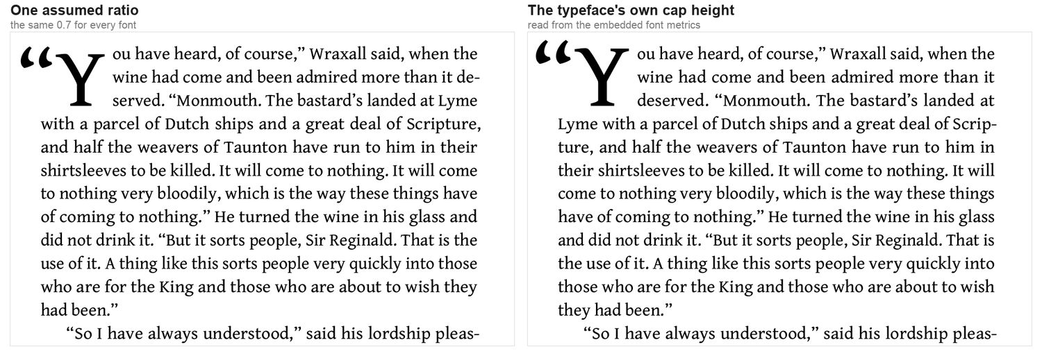
Drop caps sized from the actual typeface.
A drop cap should sit flush with the top of the first line and land on the baseline of the last line it spans. Getting that right means knowing the typeface's cap height, which differs from face to face. Assuming one ratio for every font is the common shortcut, and it is wrong for most of them.
And the small ones.
- The fi and fl ligatures are on, and the file stays searchable. Many PDFs lose the letters behind a ligature, so the book stops being searchable or readable by a screen reader. In our export of the novel, the word “first” comes out of the text layer 123 times, the same as Word's 122. In the other formatter's, 14 times — and 57 words come out with a ! where the ligature was.
- Pair kerning from each typeface's own tables, so To, Wa and AV sit the way the type designer drew them.
- A line opening with an em or en dash is penalized, because a dash stranded at the start of a line reads as a mistake.
- Block paragraphs are separated by half a line, not a full one. A full blank line is a word-processor habit that reads as a section break and costs pages.
- Body text prints in pure black ink only, not a four-color “rich black” that fuzzes small type when the plates do not line up.
Your book, set like this.
Print PDF and EPUB from one manuscript, free to preview.
The other half of the story
Where we’re still improving.
No typesetter is perfect, and a comparison that hides its weak spots is not worth trusting. Here is where ours still has room to grow.
- We squeeze a few spaces. Our letters can shrink a little as well as stretch, so some lines come out slightly tight: 1.33% of our word gaps are narrower than 80% of normal. The other formatter almost never tightens a line: 0.11%. Word, 4.30%. A slightly tight space is far harder to see than a wide one, which is why we accept the trade.
- A page that ends mid-word. One of our pages ends on a hyphen, so the reader turns the page halfway through a word. Word also has one; the other formatter has five.
- Not every page fills. 231 of 234 at Balanced, 233 of 234 at Flush page bottoms. Not 100%, and we will not say it is.
- Oldstyle figures. Numerals that sit on the baseline with ascenders and descenders, the way they do in many literary books, are not selected. A genuine omission.
- Small capitals in two faces. Four of our six text faces set real small capitals. Crimson Text and Lora contain none, so there we scale the capitals down and letterspace them — a good imitation, still an imitation.
- Balancing a spread by eye. The engine fills short pages and closes rivers, but it does not weigh a facing-page spread as a single picture the way a human compositor would. We built a spread matcher twice and measured no real gain, so it stays off.
- Optical kerning — not a gap. We use each typeface's own kerning, which for professionally drawn book faces is the right answer. Optical kerning overrides the designer with a computed guess; it rescues badly made fonts rather than improving good ones.
The honest claim is narrow: the engine gets the structural typography right, and it is not a complete substitute for a typographer.
Every number
The full table.
Word was set up with care, not left at its defaults: mirror margins, automatic hyphenation limited to two in a row, widow and orphan control, a 0.25-inch first-line indent and no space between paragraphs. All three books fit the same 60–62 characters and eleven word gaps onto a line.
| Whole book | MS Word | The other formatter | BookPublish |
|---|---|---|---|
| The page | |||
| Pages that fill to the bottom | 54.1% | 87.4% | 98.7% |
| Pages with a river of white | 41 of 222 | 194 of 249 | 3 of 261 |
| Paragraphs with a gap over 1½ spaces | 51.7% | 84.2% | 3.8% |
| Paragraphs with a gap over 2 spaces | 11.8% | 47.7% | 0.8% |
| The line | |||
| Slack pushed into word spaces (median) | 3.77pt | 11.51pt | 0.00pt |
| Typical word gap | 113.4% | 143.0% | 100.0% |
| Word gap, 90th percentile | 159.1% | 205.9% | 112.1% |
| Gaps stretched past 133% | 27.59% | 60.24% | 2.89% |
| Gaps stretched past 150% | 14.01% | 42.89% | 1.00% |
| Lines with a gap over 2 spaces | 139 | 787 | 9 |
| Lines with a gap over 2½ spaces | 23 | 204 | 0 |
| Loose line beside tight line | 22.75% | 34.57% | 0.98% |
| Hyphens and last lines | |||
| Lines ending in a hyphen | 9.18% | 2.49% | 0.29% |
| Three automatic hyphens in a row | 0 | 0 | 0 |
| One-word last lines | 15.9% | 10.3% | 5.7% |
| Where it’s close | |||
| Gaps tighter than 80% | 4.30% | 0.11% | 1.33% |
| Pages ending on a hyphen | 1 | 5 | 1 |
Check it yourself
How these numbers were produced.
Everything was measured on the exported PDFs by one script in one run, reading each page's own margins — a book-wide edge would mark every left-hand page ragged. A word gap is the white between two words on a justified line, expressed against the typeface's natural space, taken from the unstretched last lines of paragraphs. All three books agree on it: 2.40pt, exactly EB Garamond's 0.2 em.
Pages that fill counts only pages followed by more of the same chapter, and calls a page full when there is no room for another line at its foot — a stricter test would punish Word, whose baselines are not on a fixed grid, for ending a few points high. Rivers uses the same detector the formatter warns authors with: gaps on consecutive lines that overlap, three lines or more, wide enough in total to see. Loose paragraphs are paragraphs of two or more lines with at least one justified line carrying a gap past the threshold.
The before-and-after table comes from the same novel run through today's engine, changing one setting at a time. The illustrations are single paragraphs picked to show each difference clearly; the tables are the whole book.
If you want to see it on your own book, the preview is free and uses the identical typesetting as the paid file.
Typeset your book
The Interior Formatter is free to use: name your book, bring your manuscript, and it sets real pages you can read before you commit to anything. You only pay when you want the files without the preview watermark.